Let’s talk about beer
I’m a big fan of designing for beer. With so much competition in the market it stretches a designers skills in figuring out how to make a brand stand out. And often there’s a chance to illustrate (I like any job that involves illustration). Luckily I’ve gotten to design for a few craft beer brands.
Creating a beer label for a craft beer brand is more than just a design task; it’s an opportunity to communicate the story, identity, and values of the brand. There are a few key design considerations to consider when designing beer.
Brand hierarchy
One of the first decisions a designer must make is whether to emphasize the brewery's brand or the specific beer varietal.
The concept of brand hierarchy vs. varietal hierarchy plays a central role in this.
Brand hierarchy prioritizes the brewery’s logo, name, and signature design elements, ensuring that no matter the beer, the brewery’s identity remains clear and consistent. This approach is often preferred for breweries looking to establish a strong, recognizable brand and is often the direction taken by big breweries (Think Molson).
Varietal hierarchy highlights the specific beer style, often giving more visual prominence to elements like the beer's name or flavor profile. This approach works well for breweries with a diverse lineup that want each beer to stand out as a unique offering. Craft beer often takes this approach and craft drinkers tend to be more motivated by flavour and experimentation rather than brand loyalty.

Varietal forward design for Born Brewing Co. The brewery name isn’t even on the primary can face, but a consistent illustration style links the cans. See more of the varying designs here.

Another design for Born Brewing Co. Varietal first but with consisten design cues to tie the family together.
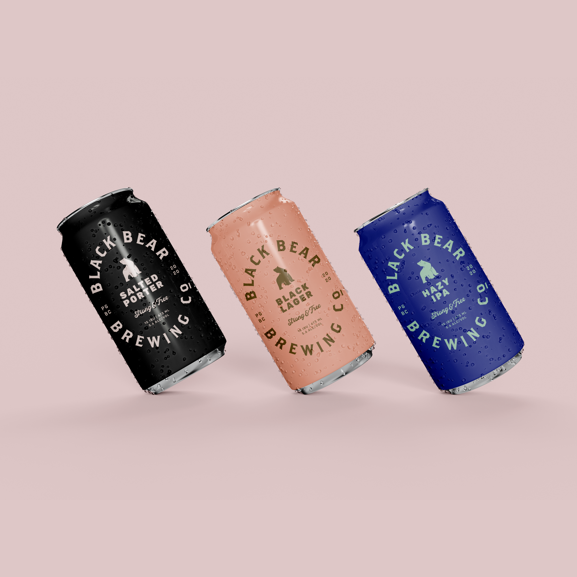
A more brand forward design approach, for a brew pub that unfortunately never launched due to some issues that arose in 2020. (ahem - covid)
Shelf presence
Whatever your approach though shelf presence and story telling are king. It needs to stand out amongst a sea of other brands. There are ways to do this through colour, bold design elements and how typography is used or a unique graphic or point of view. I’ve been known to sneak into liquor stores to put mock-ups on the shelf to see how they look in-situ surrounded by the competition.

Illustration for Stanley Park Brewing done with Will Creative - Highlighting the namesake concession stand, telling the story of the brewery and the park it calls home.
An extended design system
A beer brand is so much more than packaging though. There are so many touchpoints that need to work for the brand from cases, to glassware, to event booths to merch. Often these are more brand forward for a longer lasting impression and greater brand awareness. Sometimes though merch may want to highlight a popular beer that customers love, or may express a fun side of the brand (like the Hi Cutie merch for Born Brewing Co. shown below)

Even though a tray is mostly a B2B touchpoint it still needs to showcase the brand.

Born Brewing Co. balances brand forward merch and varietal forward merch, highlighting some favourite beers.

Branded Holiday Glassware - inspired by that seasons holiday release - for Born Brewing Co.

I’m wearing a varietal forward shirt for Born Brewing Co. That I designed and grabbing a brand forward mug for R&B Brewing I designed.