Helping you hit the slopes
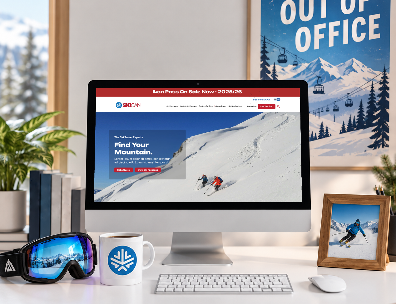
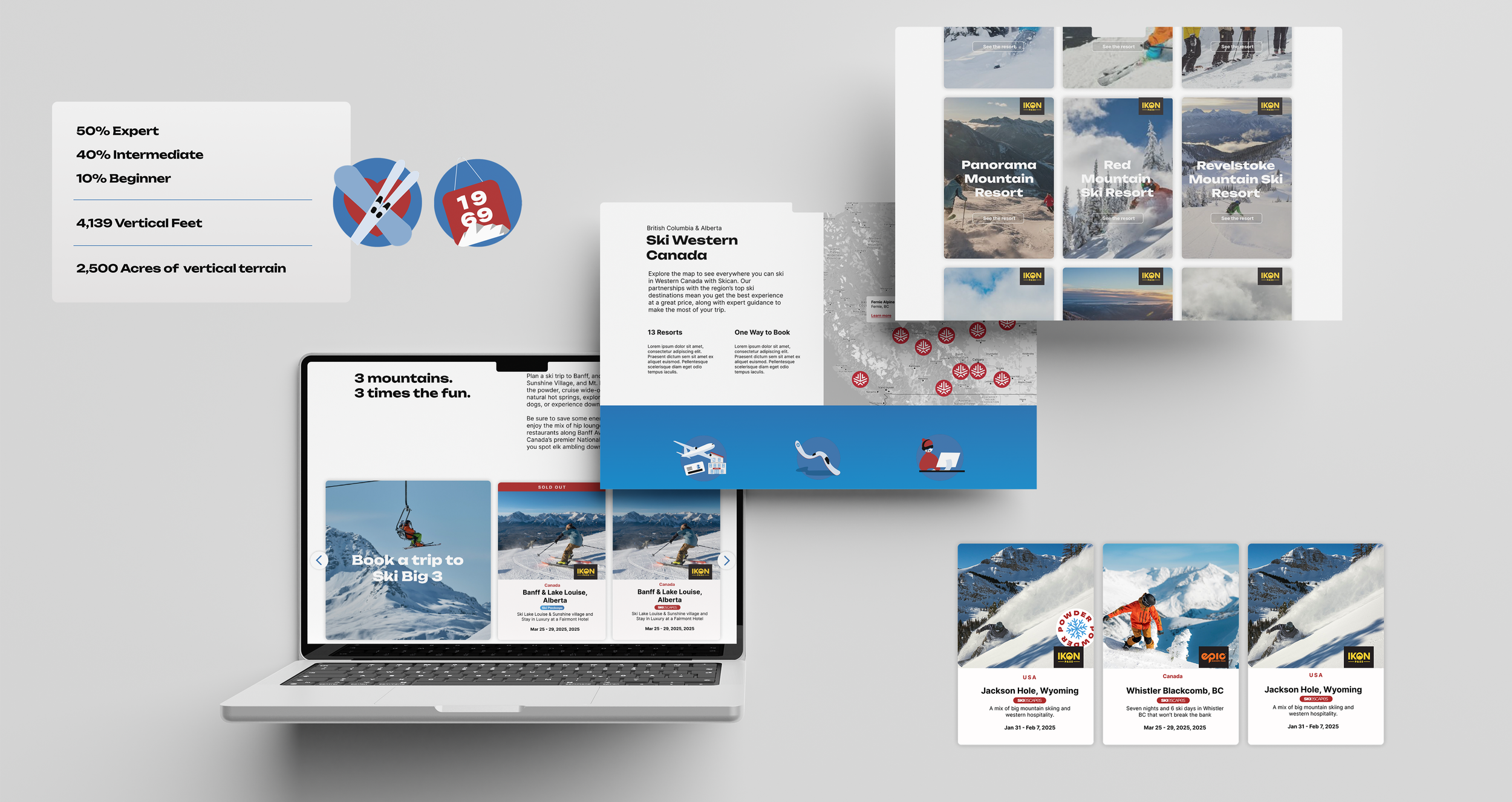
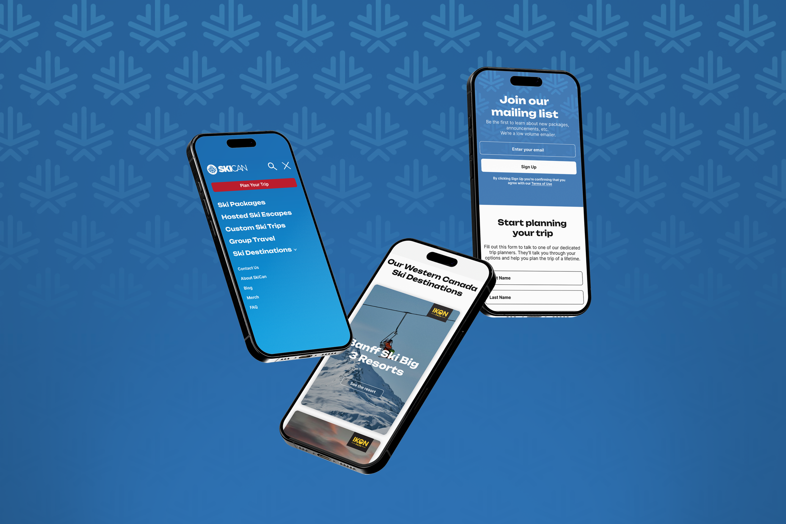
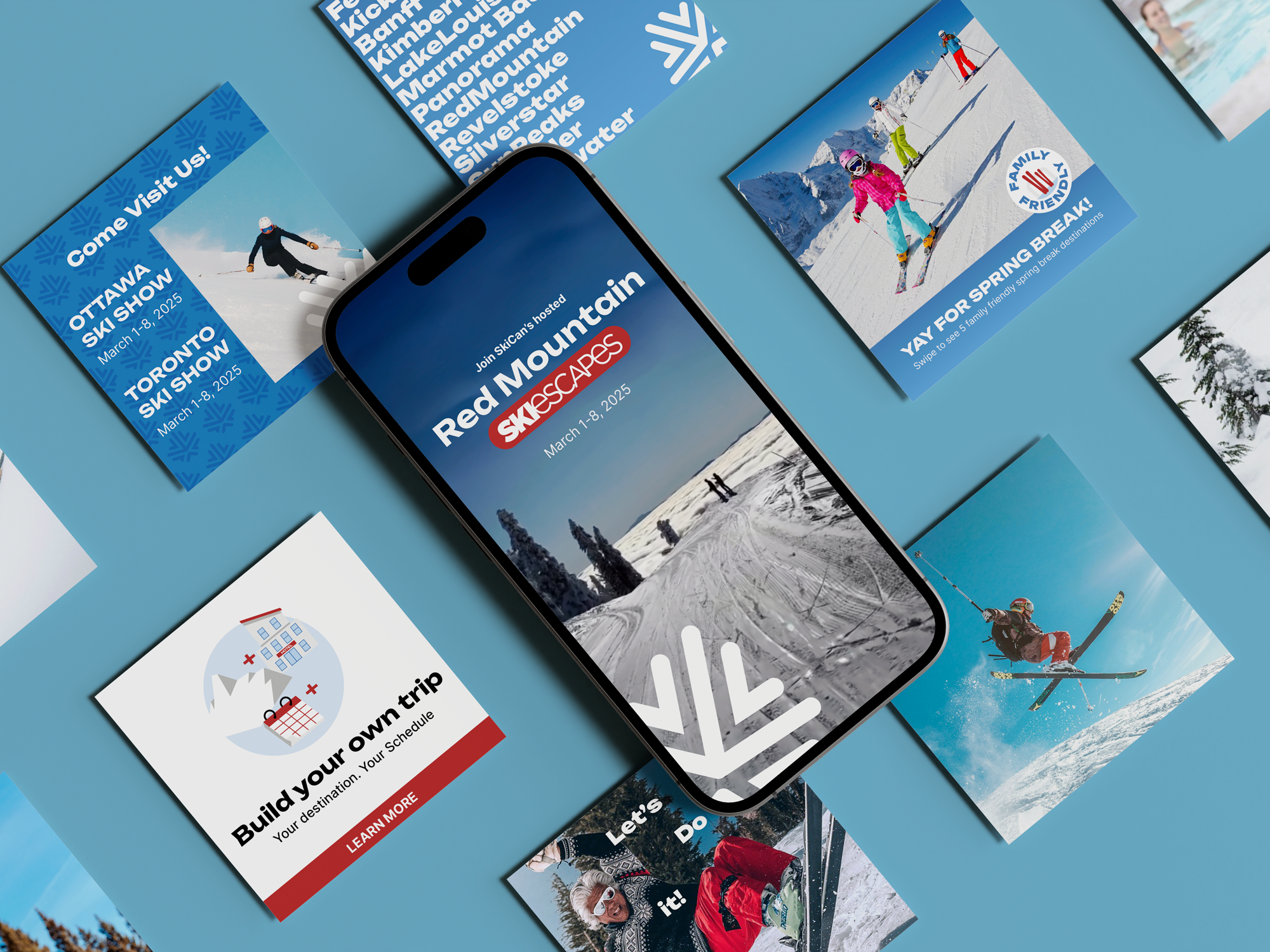
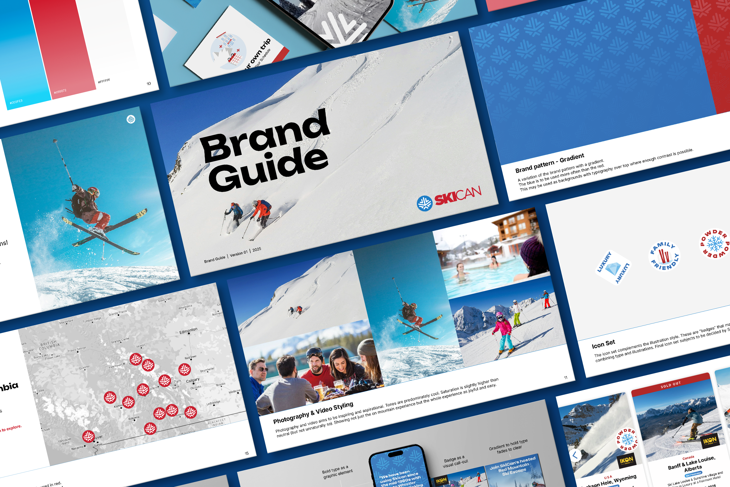
SkiCan needed a light refresh to the brand and an overhaul of their site. Keeping the logo the same and the colour palette, we retained the core of the brand. With a 20 year history and long-term customers it was key that we evolve rather than change completely. A series of patterns were developed to complement the epic ski shots that had access too. A custom illustrated icon set was created to communicate brand values, attraction highlights, and customer benefits. Updated typography feels bold and just quirky enough for skiers. (Anyone who has paid attention to the way runs are named knows skiers love a little quirk).
Client: SkiCan
Role: Brand Refresh and UX/UI Design
Partners: Nathan Atnikov - Writing & Strategy




A few ways we improved the site:
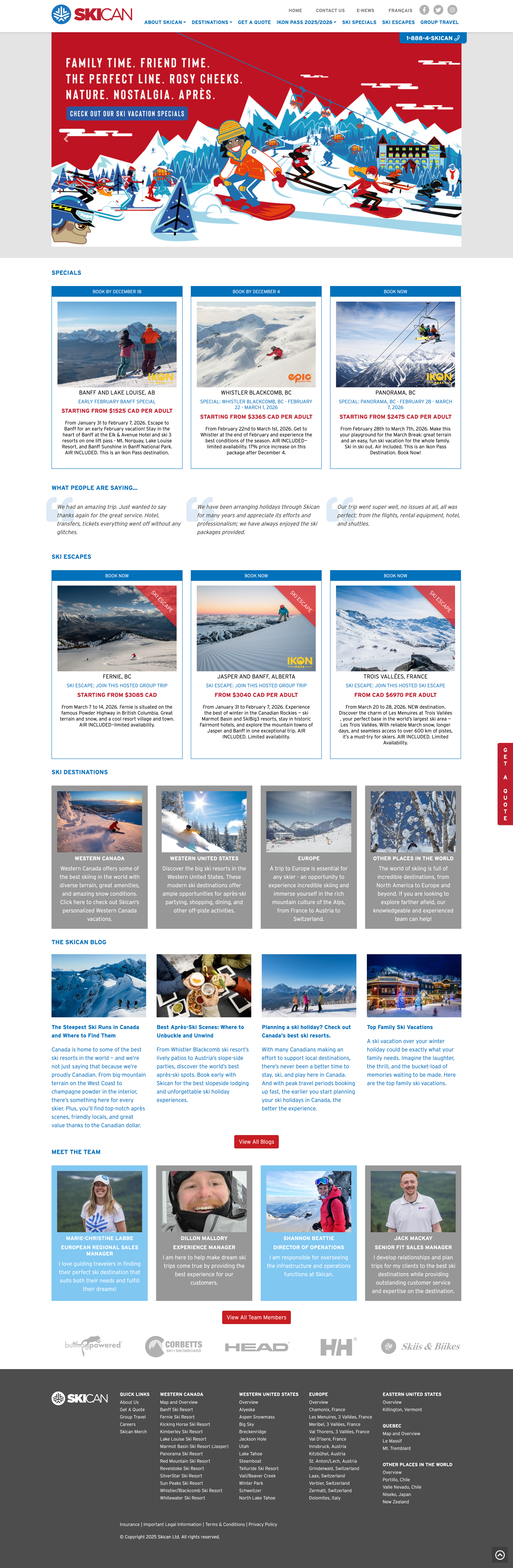
Overlay to hold type and call to action on the homepage allow for big bold photography or video of their trips.
Start with a clear description of what they do and what makes them differnt for new clients.
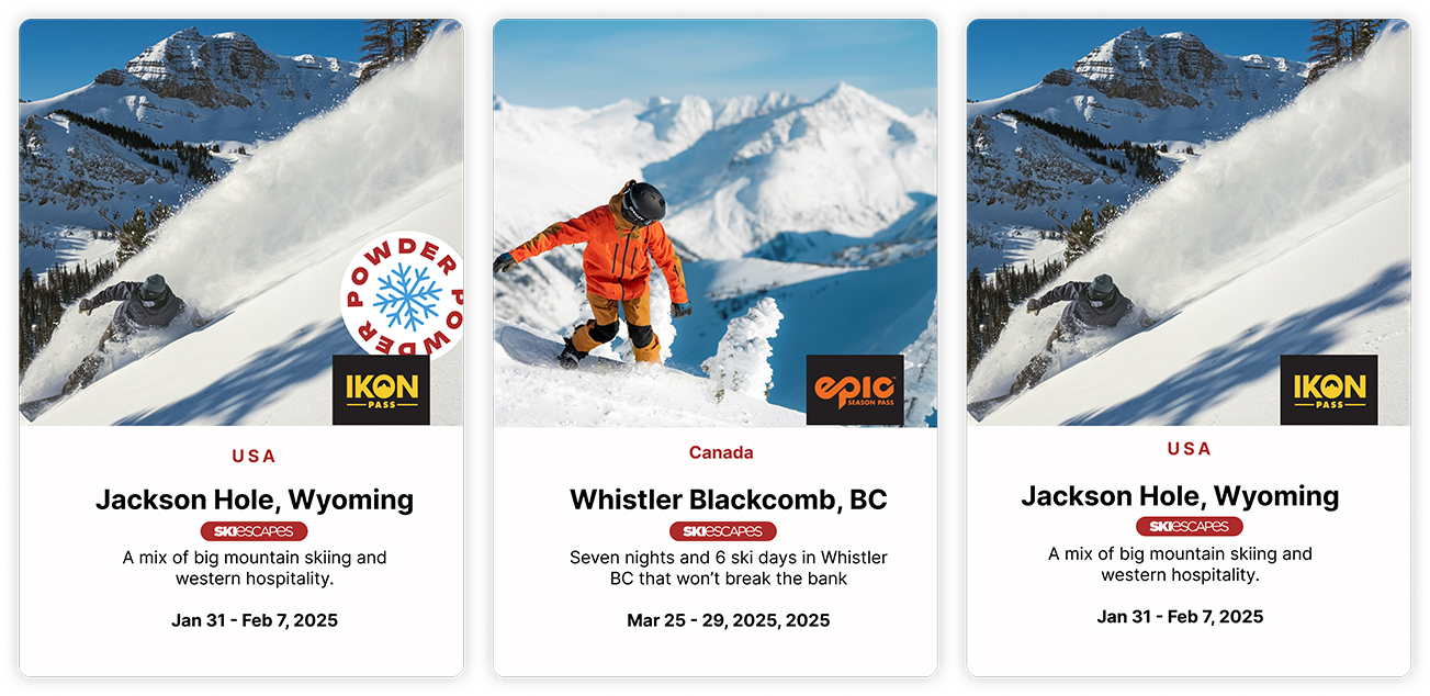
A flexible “card” system for highlighting trips and locations in a way that is more “skimmable”.
Clear indications on which locations use an epic or icon pass.
Simplified customer testimonials.
Bring FAQ’s right onto the homepage as well as newsletter signup.
Contact form with more detailed fields added to the homepage to better arm their sales team with information for the follow-up call.