Artisan Pasta, Reimagined.
Oravio is a new frozen stuffed pasta brand aiming to redefine the premium grab-and-go meal experience. Born from Pasta D’Angelo’s culinary expertise, Oravio leverages flash-frozen techniques to deliver restaurant-quality meals at home.
The design system needed to communicate quality, innovation, and simplicity, while differentiating from legacy competitors like Olivieri and Rana, and aligning with emerging consumer values: local production, affordability, and premium convenience.
Client: Oravio Pasta
Role: Creative Direction + Design
Partners: Mark Busse - Strategy & Positioning
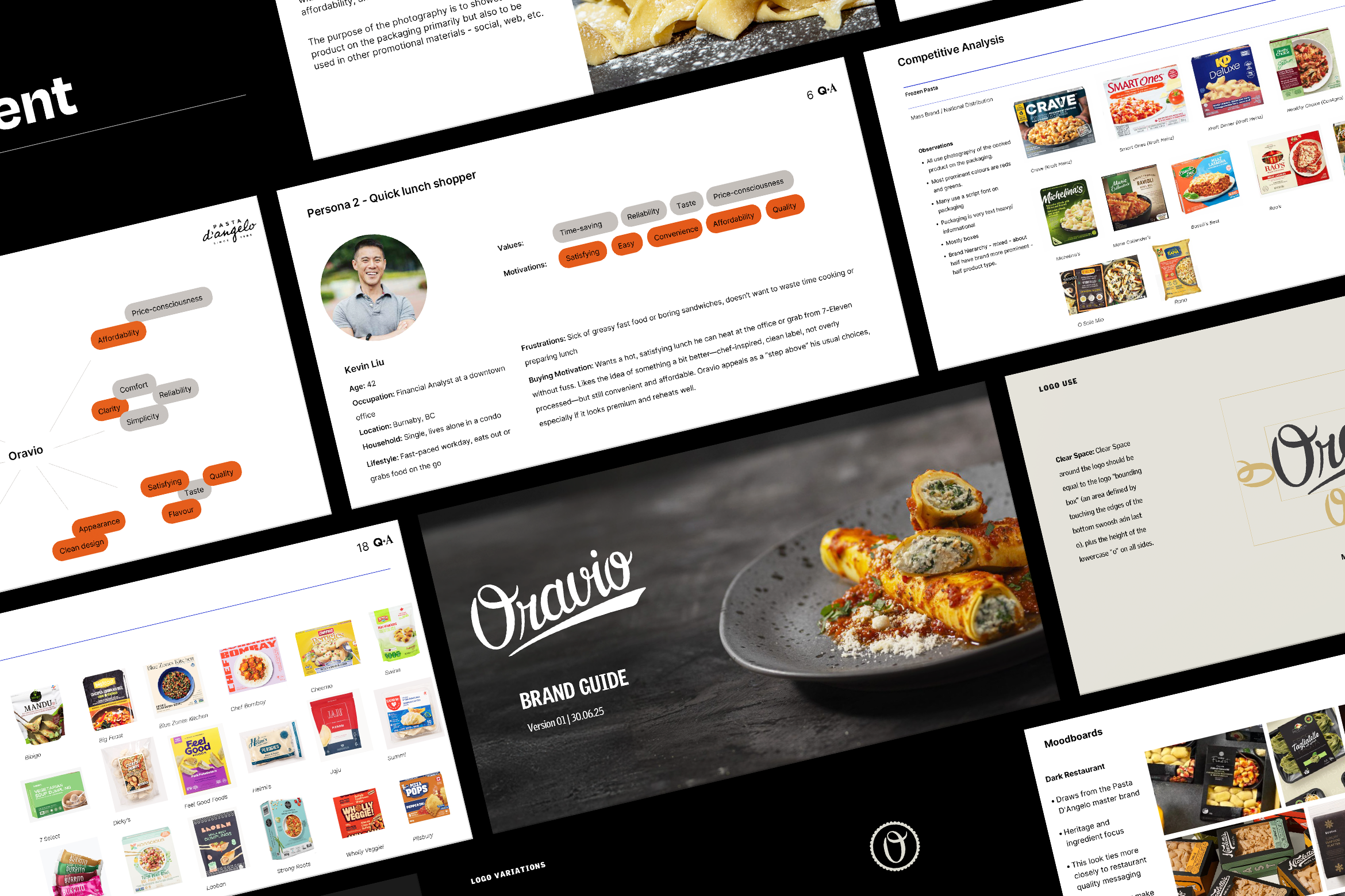
For Oravio before any design began I worked closely with Mark Busse and the client in developing strategy and positioning. We looked closely at who the potential buyers of the product would be in the retail environment and what their motivations are. It also included an extensive competitor analysis to help determine how we could make Oravio stand out. This also involved a lot of getting chilly hanging out in the freezer aisle of grocery stores.
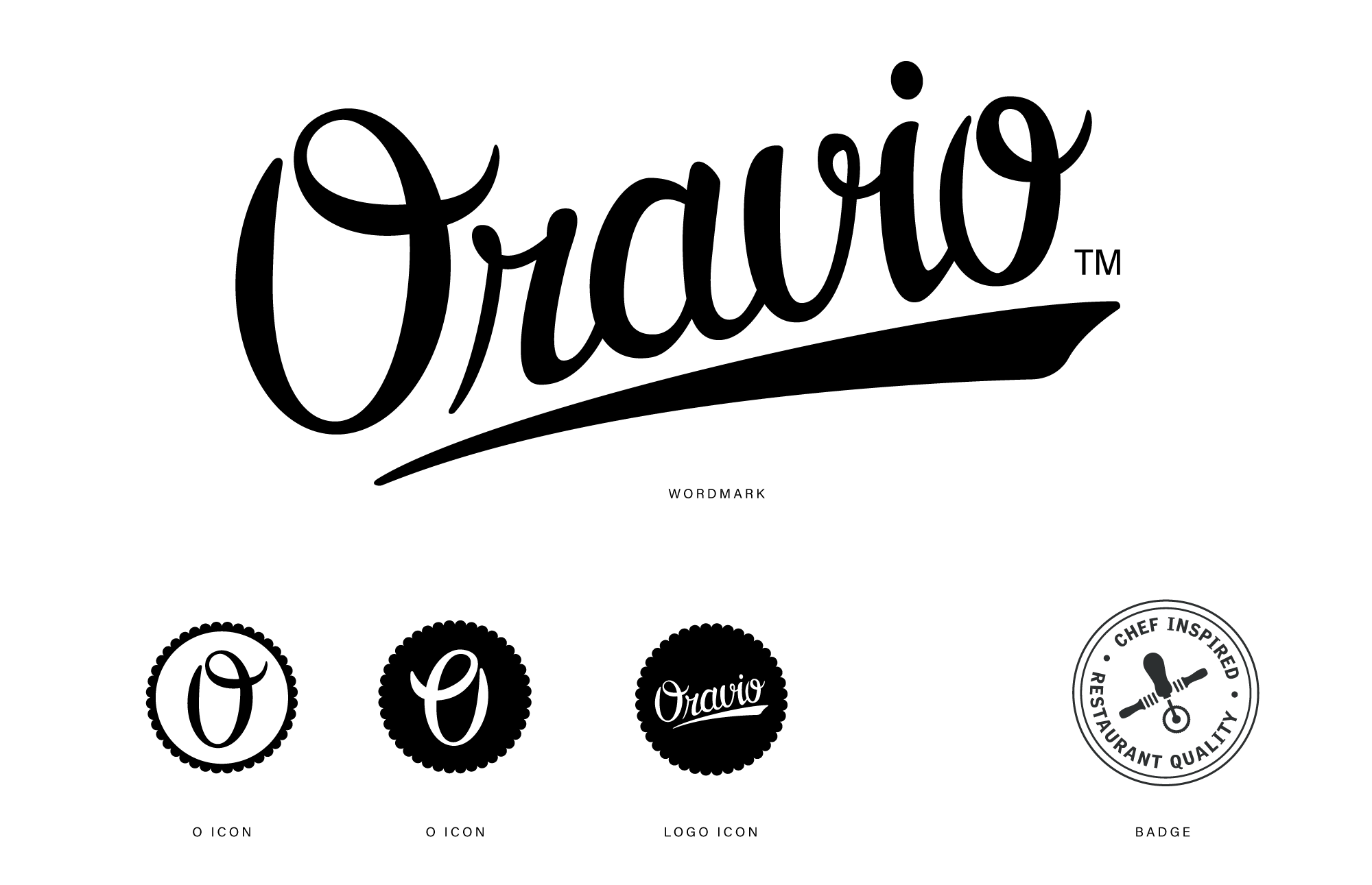
The logo was developed using a custom script that feels like it hovers somewhere between authentic vintage packaging signalling craft and homemade qualities, and something that would also feel at home in a modern kitchen.
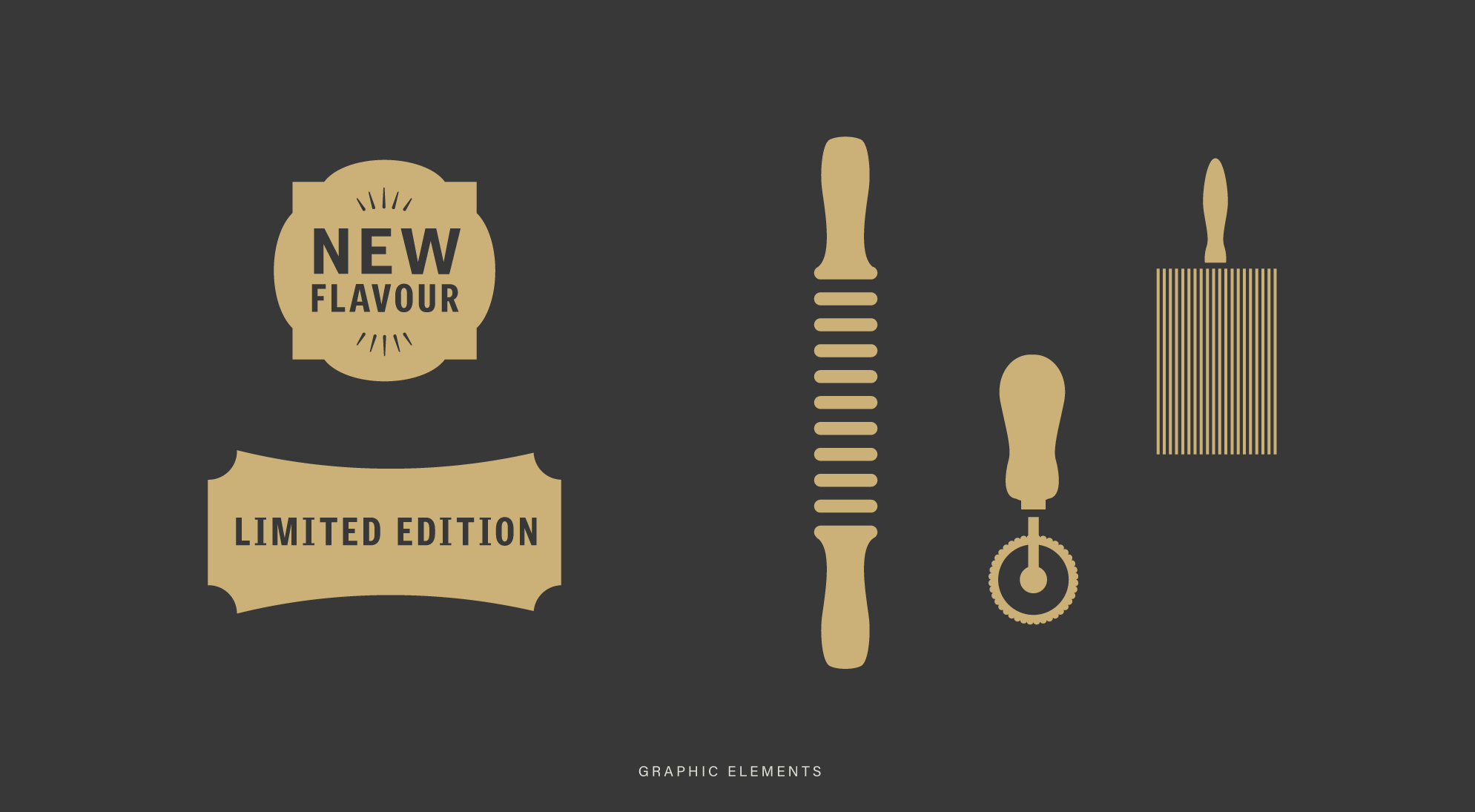
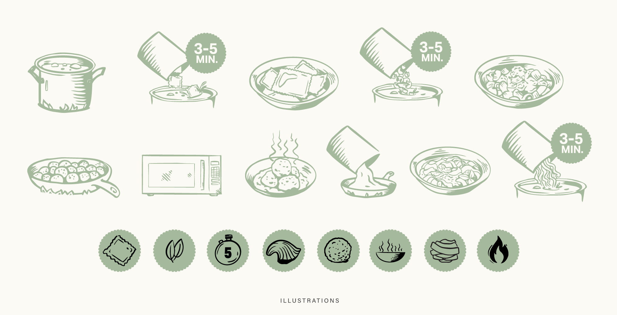
A larger graphic language was developed along these lines with nods to traditional pasta tools and a hand-drawn approach to packaging call-outs and cooking instructions. This helps to reinforce the artisinal nature of the product.
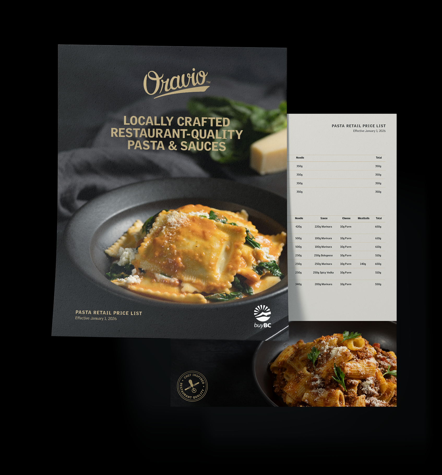
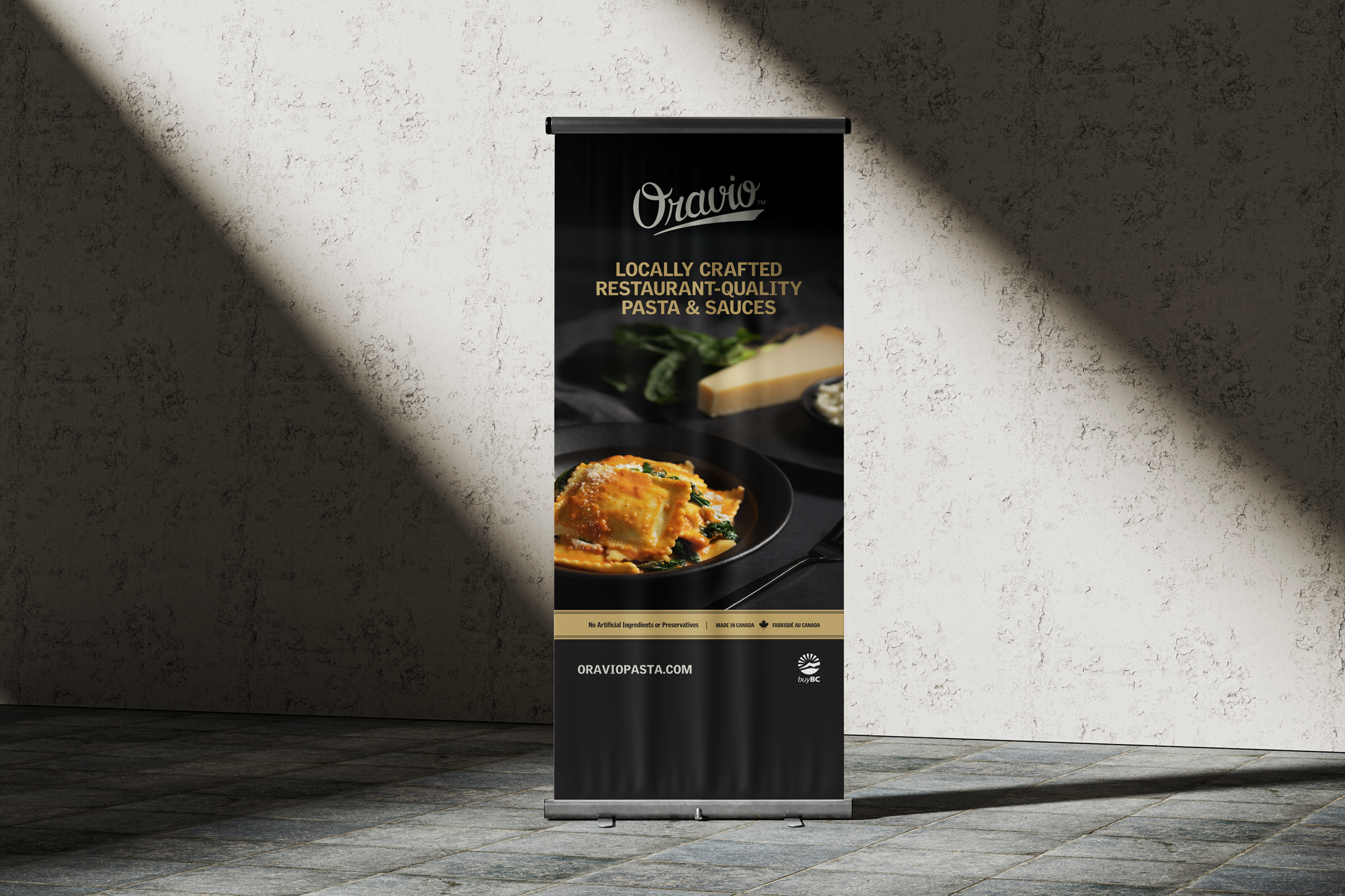
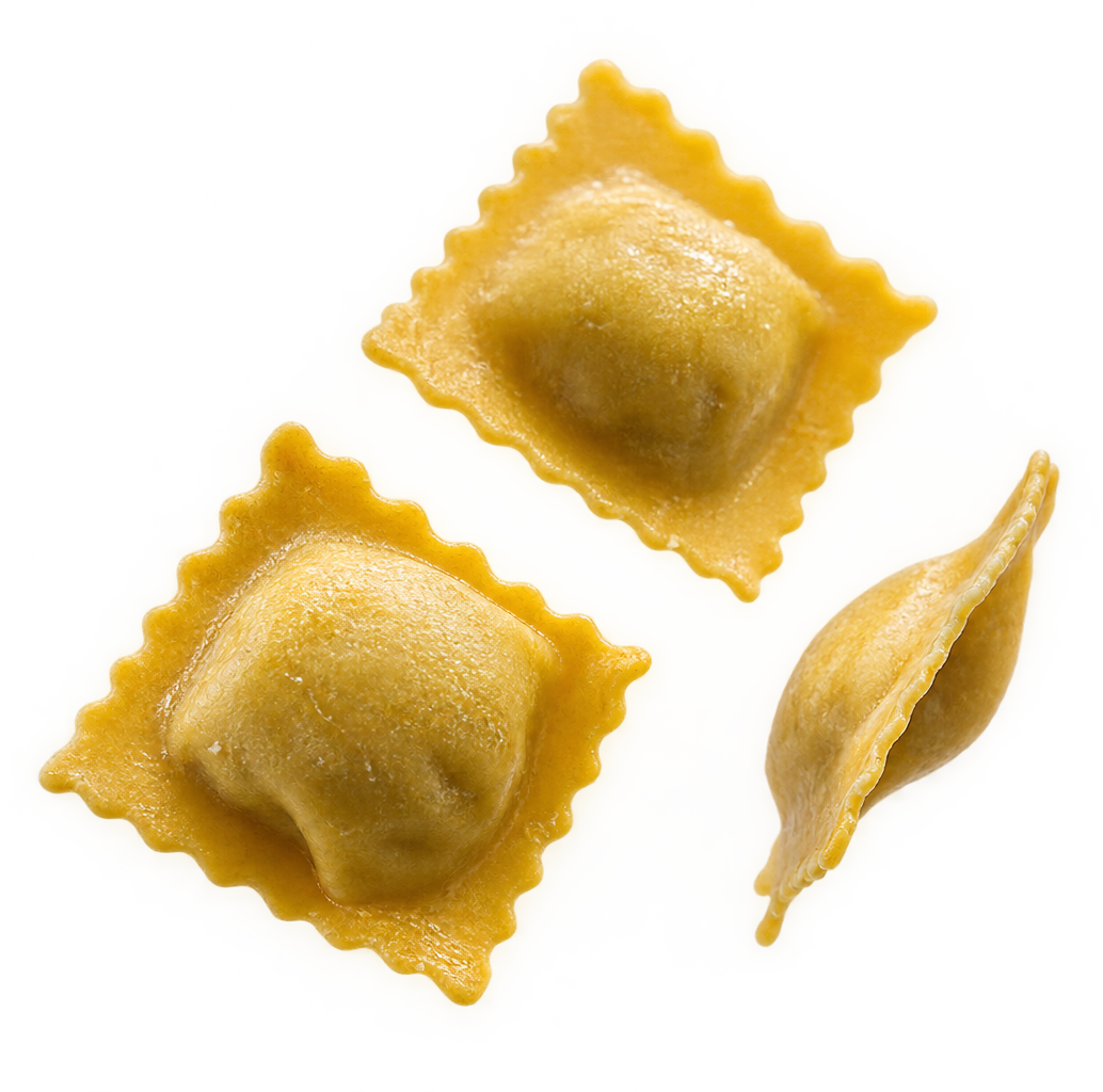
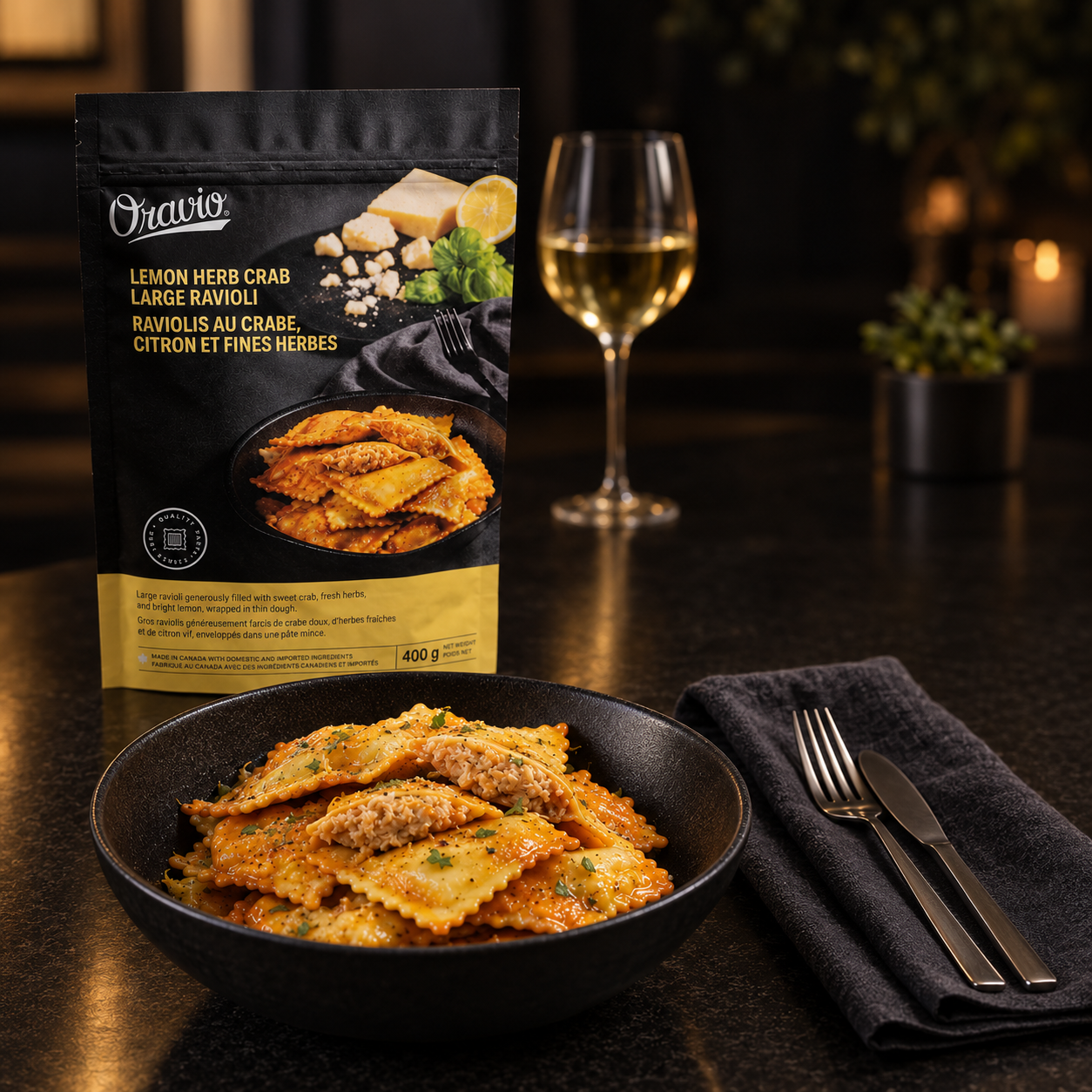
Where the brand ultimately needs to work is on the shelf. For bringing the brand to life, a photography style was developed that ties closely to Oravio’s parent brand Pasta D’Angelo leveraging this recognition in the food service space.
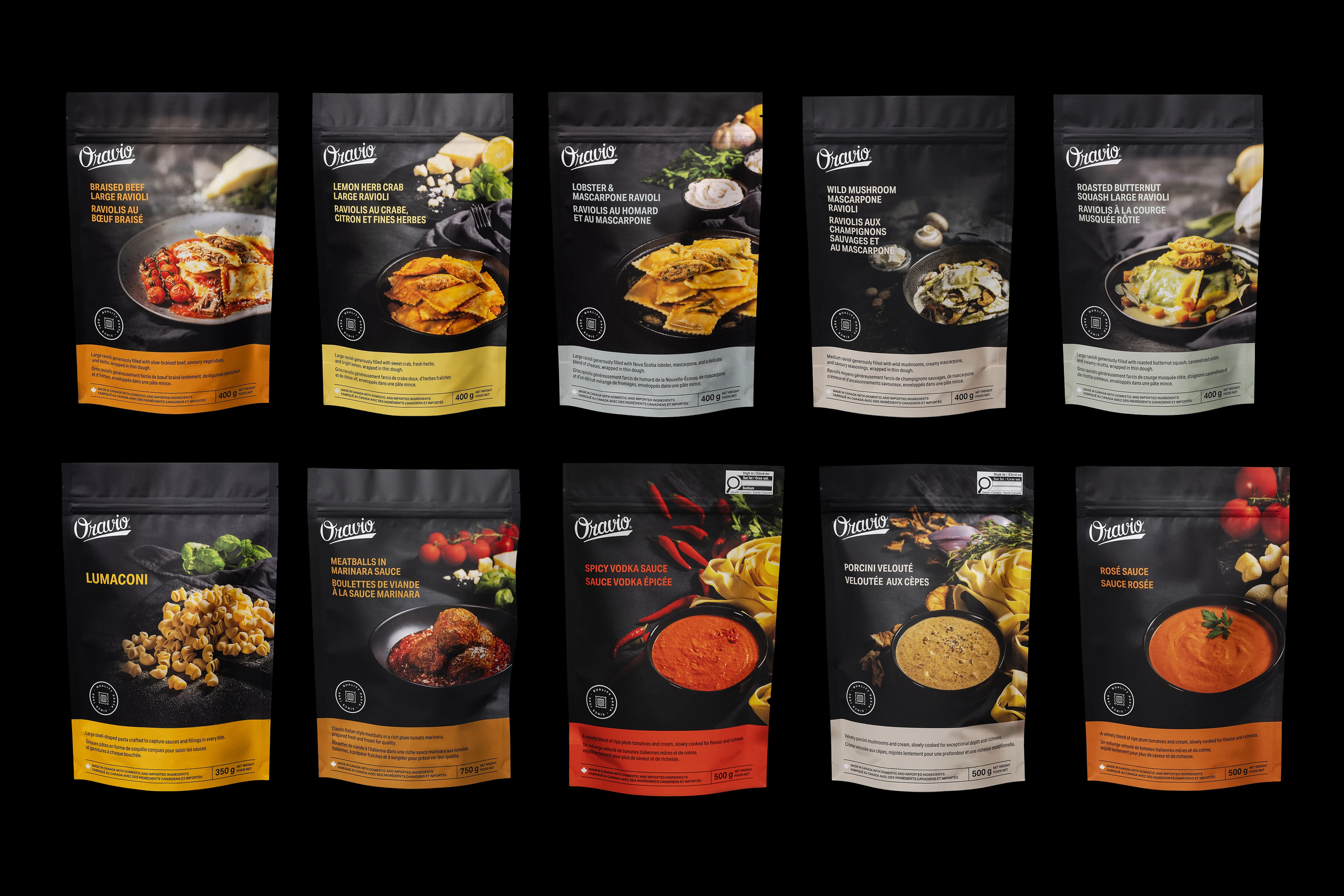
An extensive colour palette was developed so that each product would have a distinct colour that worked with the larger family palette to feel cohesive. Colour needed to be taken in choosing colours that reflect ingredients and taste while also allowing enough contrast for consistent type treatments and colours to be used.
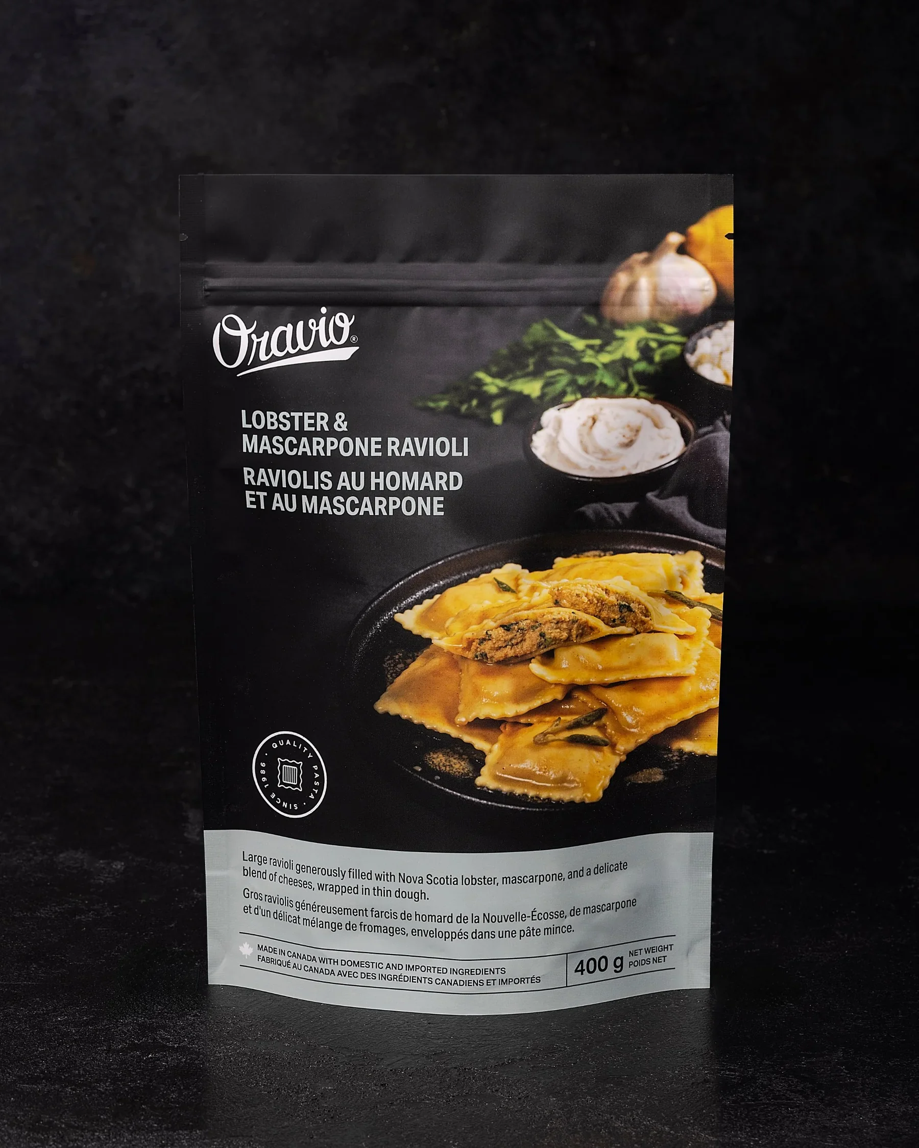
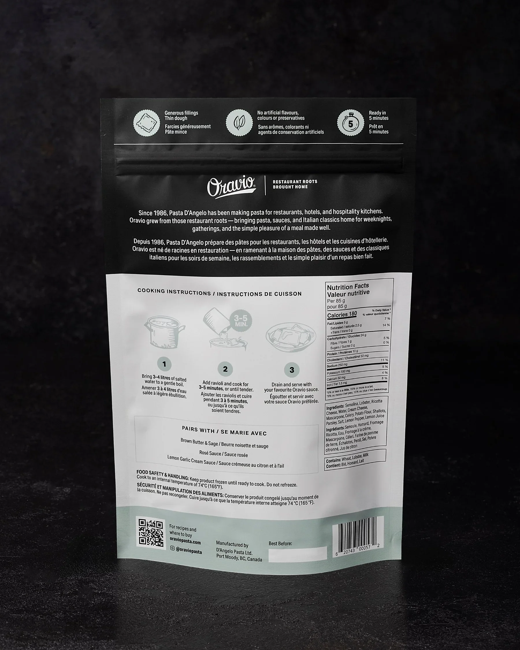

The back of the packaging ties in the colour from the front and brings in those hand drawn illustrations to reinforce the artisanal feel from the product and make the brand feel more unique.